panel.xml
The panel.xml file is a configuration file for virtual cockpit gauges and glasscockpits that are loaded as part of the instrumentation of an aircraft. In general, most of the elements used in this file are custom elements that you define and then retrieved in your gauge JavaScript code, and you can also use some of the elements that the SDK has defined in the JS files included for the Microsoft Flight Simulator aircraft.
NOTE: This file is only used by JavaScript instruments, and is not used by WebAssembly instruments.
This file is well suited to making variations of your glasscockpit depending on the aircraft that will be using it, although it should be noted that it is absolutely optional and many aircraft never have any need for this XML file. It is worth noting that there is only ever one panel.xml file for any single aircraft, and it can - and usually does - contain data and logic for multiple instruments.
When creating the panel.xml file, it should have the following structure:
<PlaneHTMLConfig>
    <!-- Instruments -->
    <Instrument>
        </Instrument>
    <!-- Annunciations -->
    <Annunciations>
        </Annunciations>
    <!-- Alerts -->
    <VoicesAlerts>
        </VoicesAlerts>
    <!-- Engines -->
    <EngineDisplay>
        </EngineDisplay>
</PlaneHTMLConfig>
All panel.xml files must have the <PlaneHTMLConfig> element at the top level, but the other internal elements to that are all optional and will be included or not depending on the requirements for the instruments being defined.
NOTE: You can find a full example of a JavaScript instrument that includes use of the panel.xml file here - Simple JavaScript Instrument Example
<[CUSTOM]>
A "custom" element is a special element that can be named as you require - for example, the following would all be valid custom element definitions: <ScreenMode>, <RadarAltitude> or <Opacity>. The value you then place within the element can be read as a string by the JavaScript for the gauge (this includes the values True and False) using the parseXMLConfig() method. Note that you may use the <Simvar /> element or Panel XML Logic Elements to define the value of the custom element instead of assigning it a fixed value or string. This SimVar can be read on the JavaScript side with a CompositeLogicXMLElement, which allows you to use a getValueAsNumber() method instead of a string.
Below is an example of an instrument that uses a few custom elements for parsing in the gauge JS file:
<PlaneHTMLConfig>
    <Instrument>
        <Name>ASVigilus</Name>
        <RightFuelName>Aux</RightFuelName>
        <RightFuelQuantity>
            <Simvar name="FUEL TANK CENTER2 QUANTITY" unit="gallon"/>
        </RightFuelQuantity>
        <RightFuelCapacity>
            <Simvar name="FUEL TANK CENTER2 CAPACITY" unit="gallon"/>
        </RightFuelCapacity>
    </Instrument>
</PlaneHTMLConfig>
In this example, three custom elements are defined and two of them use the <Simvar /> sub element to create their value.
<Instrument>
The instrument element is used to define the values and electric component logic for a virtual cockpit instrument. It has no attributes and can contain the following sub-elements: <Name>, <Electric>, <AlwaysUpdate>, <SkipValidationAfterInit>, <HighlightBackgroundOpacity>, <[CUSTOM]>. Note you can have as many instrument element definitions as you have virtual cockpit gauges in the aircraft.
<Name>
The name element is where you give the templateID as defined in your glasscockpit main class.
<Electric>
Inside this element you can define your the logic of the electrical system associated with the virtual cockpit instrument being defined. Usually the electrical behavior of your glasscockpit is defined by several combinations of switches (Battery, Avionics and Breakers, for example) so you can define a set of SimVars here (using the <Simvar /> sub-element) that link the instrument to these switches.
This element has no attributes and is a sub-element of <Instrument>. Below is an example of an instrument with the electrical system setup:
<PlaneHTMLConfig>
    <Instrument>
        <Name>AS1000_PFD</Name>
        <SyntheticVision>True</SyntheticVision>
        <RadarAltitude>True</RadarAltitude>
        <Electric>
            <Or>
                <Simvar name="CIRCUIT ON:28" unit="Boolean"/>
                <Simvar name="CIRCUIT ON:29" unit="Boolean"/>
            </Or>
        </Electric>
    </Instrument>
</PlaneHTMLConfig>
In this example, if either Circuit 28 or Circuit 29 is ON, then the electrical system for the gauge will be turned on.
It is important to note that you may use many of the Panel XML Logic Elements - like <And>, <GreaterEqual>, <Subtract>, etc... - along with the <Simvar /> sub element within the <Electric> element to define the conditions under which the electrical system will operate.
<AlwaysUpdate>
Within the simulation menu settings there is an option to set the refresh rate of glasscockpit displays. When this element is included and set to true, the instrument will use the full refresh rate, regardless of the setting.
 <Instrument>
     <Name>A320_Neo_CDU</Name>
     <Electric>
         <Simvar name="CIRCUIT ON:56" unit="Boolean"/>
     </Electric>
     <AlwaysUpdate>True</AlwaysUpdate>
 </Instrument>
<SkipValidationAfterInit>
Glasscockpit displays can have five "states", which are (in order): Off, Init, WaitingValidation, On, and Reversionary. Now, some glasscockpits will need user input - for example, a button press - to go from the Init stage to the On stage, and will be in the intermediate WaitingValidation stage until that happens. However, this may not always be the case, and so you can specify this element and set it to true to skip directly from Init to On.
<Instrument>
    <Name>AS1000_MFD</Name>
    <SkipValidationAfterInit>True</SkipValidationAfterInit>
    <Electric>
        <Simvar name="CIRCUIT ON:30" unit="Boolean"/>
    </Electric>
</Instrument>
<HighlightBackgroundOpacity>
For checklist purposes, parts of the glasscockpit can be highlighted by reducing the opacity of the rest of the screen around it. For that to happen, you need to include this element and set the opacity level of the background from 0.0 to 1.0.
 <Instrument>
     <Name>AS_EPM</Name>
     <Electric>
         <Simvar name="CIRCUIT GENERAL PANEL ON" unit="Boolean"/>
     </Electric>
     <HighlightBackgroundOpacity>0.3</HighlightBackgroundOpacity>
 </Instrument>
<Annunciations>
This element is used to define the list of all messages that can displayed in the warning area of compatible instruments (eg the G1000, an airliners EICAS screen, etc...). This element has no attributes and is a container for one or more <Annunciation> elements. The following example creates an annunciation "warning" event for when the main bus voltage is equal to or less than 25.5:
<PlaneHTMLConfig>
    <Annunciation>
        <Type>Warning</Type>
        <Text>LOW VOLTS</Text>
        <Condition>
            <LowerEqual>
                <Simvar name="ELECTRICAL MAIN BUS VOLTAGE:3" unit="volts"/>
                <Constant>25.5</Constant>
            </LowerEqual>
        </Condition>
    </Annunciation>
</PlaneHTMLConfig>
<Annunciation>
This is a container element for the logic and text related to a single annunciation. It is a sub-element of <Annunciations>, has no attributes, and can contain the following sub-elements: <Type>, <Text>, <Condition>. You may have multiple <Annunciation> elements in a file.
<Type>
This specifies the type of annunciation that is being defined, which can be one of the following:
- Warning - This is a serious issue that needs resolving
- Caution - This is a minor issue that you should be aware of and try to resolve
- Advisory - This is a recommendation that something may be wrong and should be checked
The element has no attributes and is a sub-element of <Annunciations>.
<Text>
This specifies the text that should be displayed when the annunciation conditions have been met. The element has no attributes and is a sub-element of <Annunciations>.
<VoicesAlerts>
This is a container element for the logic related to alerts for those aircraft instruments that support the voice alerting system (for example, the G1000, airliner EICAS screens, etc...). This element has no attributes and is a container for one or more <Alert> elements. The following example creates a voice alert event for when the STALL WARNING SimVar is "True":
<VoicesAlerts>
    <Alert>
        <Type>Warning</Type>
        <ShortText>PULL UP</ShortText>
        <LongText>PULL UP</LongText>
        <SoundEvent>aural_pull_up</SoundEvent>
        <Condition>
            <And>
                <LinearMultiPoint>
                    <Table>
                        <ReferencePoints>1160,2320,4930,12000</ReferencePoints>
                        <Maximums>0,1070,2380,4285</Maximums>
                    </Table>
                    <Param>
                        <Multiply>
                            <Simvar name="VERTICAL SPEED" unit="feet per minute"/>
                            <Constant>-1</Constant>
                        </Multiply>
                    </Param>
                    <Param>
                        <Simvar name="PLANE ALT ABOVE GROUND" unit="feet"/>
                    </Param>
                </LinearMultiPoint>
                <Not>
                    <Simvar name="SIM ON GROUND" unit="bool"/>
                </Not>
            </And>
        </Condition>
    </Alert>
</VoicesAlerts>
<Alert>
This is a sub-element of <VoicesAlerts>, has no attributes, and can contain the following sub-elements: <Type>, <ShortText>, <LongText>, <SoundEvent>, <Condition>. You may have multiple <Alert> elements in a file.
<Type>
This is a sub-element of <Alert>, and has no attributes. It is used to define the type of alert that is being triggered, and can be one of the following:
- Warning: This is a serious warning that something is wrong. This type usually requires a
<ShortText>element and a<LongText>element as well. - Caution: This is a caution that something may be wrong. This type usually requires a
<ShortText>element and a<LongText>element as well. - SoundOnly: This is an alert that is sound only and doesn't use the
<ShortText>element nor the<LongText>element. - Test: This is a test alert, and is usually accompanied by a
<ShortText>element.
<ShortText>
The warning message as a short-form string.
<LongText>
The warning message as a long-form (more explicit) string.
<SoundEvent>
This element is used to specify the Wwise Event that should be associated with the alert being created. The event name used here should match the WwiseEvent attribute that has been set in the <Sound> element of the <AvionicSounds> container in the sound.xml file. See the Avionic Sounds Example for an example of use.
<Once>
This is a sub-element of <Alert>, and has no attributes. When set to "True" it tells the panel logic that this alert should only be played once, for example:
<Alert>
    <Type>SoundOnly</Type>
    <SoundEvent>aural_taws_system_test_ok</SoundEvent>
    <Condition>
        <And>
            <Greater>
                <TimeSinceStart/>
                <Constant>30000</Constant>
            </Greater>
        <InstrumentWasOff/>
        </And>
    </Condition>
    <Once>True</Once>
</Alert>
<EngineDisplay>
The <EngineDisplay> element is a container element that can hold one or more <Gauge> and/or <Text> elements, as well as define <Function> elements for later use. This container has no attributes and it is used to help with the styling of the instruments that are linked to the operation of the engine, linking the styles to specific values derived from conditions, values or SimVars. This element is mostly used in the G1000, G3000, G3X and G3X Touch displays, but can be applied to most glasscockpits.
<EngineDisplay>
    <Gauge>
        <Type>Horizontal</Type>
        <ID>FuelPress_Gauge</ID>
        <Title>FUEL</Title>
        <Unit>PSI</Unit>
        <Minimum>0</Minimum>
        <Maximum>10</Maximum>
        <Style>
            <ValuePos>End</ValuePos>
        </Style>
        <Value>
            <Simvar name="GENERAL ENG FUEL PRESSURE:1" unit="psi"/>
        </Value>
        <BeginText></BeginText>
        <EndText></EndText>
   </Gauge>
   <Text>
       <Left>CHT °F</Left>
       <Right id="CHT">
           <ToFixed precision="0">
               <Simvar name="ENG CYLINDER HEAD TEMPERATURE:1" unit="farenheit"/>
            </ToFixed>
        </Right>
    </Text>
</EngineDisplay>
<Gauge>
This is an element that belongs in the <EngineDisplay> or <Column> container element, and you can have multiple of these in the panel.xml file. This element has no attributes and can contain the following sub-elements: <Type>, <ID>, <Title>, <Unit>, <Minimum>, <Maximum>, <Style>, <Value>, <Value2>, <ColorZone>, <ColorLine>, <ReferenceBug>, <RedBlink>, <GraduationLength>, <GraduationTextLength>, <BeginText>, <EndText>, <CursorText>, <CursorText2>.
The <Gauge> element is used to customise some of the default glasscockpit gauges available to developers for inclusion in their own displays. Customisation is done by first selecting the <Type> of gauge to be created, then defining the <Style> of the gauge, and then finally refining the way the gauge will be displayed using text and other elements. The current value that the gauge will be using for the display is defined using the <Value> element (and sometimes the <Value2> element too, depending on instrument <Type>), which can use many of the Panel XML Logic Elements - like <And>, <Or>, <Lower>, <GreaterEqual>, etc... - along with the <Simvar /> element or Unique Logic Elements to extract the required information from the simulation for the gauge.
The example below shows a full and complex implementation of this element:
<Gauge>
    <Type>DoubleVertical</Type>
    <Style>
        <Height>70</Height>
        <TextIncrement>1</TextIncrement>
    </Style>
    <ID>Piston_LoadGauge</ID>
    <Title>LOAD</Title>
    <Unit></Unit>
    <Minimum>0</Minimum>
    <Maximum>100</Maximum>
    <Value>
        <Max>
            <Min>
                <Multiply>
                    <Divide>
                        <Multiply>
                            <Simvar name="ENG TORQUE:1" unit="Foot pounds"/>
                            <Divide>
                                <Simvar name="GENERAL ENG RPM:1" unit="rpm"/>
                                <Constant>5252</Constant>
                            </Divide>
                            <Constant>550</Constant>
                        </Multiply>
                        <Divide>
                            <Gamevar name="AIRCRAFT MAX RATED HP" unit="ft lb per second"/>
                            <Simvar name="NUMBER OF ENGINES" unit="number"/>
                        </Divide>
                    </Divide>
                    <Constant>100</Constant>
                </Multiply>
                <Constant>100</Constant>
            </Min>
            <Constant>0</Constant>
        </Max>
    </Value>
    <Value2>
        <Max>
            <Min>
                <Multiply>
                    <Divide>
                        <Multiply>
                            <Simvar name="ENG TORQUE:2" unit="Foot pounds"/>
                            <Divide>
                                <Simvar name="GENERAL ENG RPM:2" unit="rpm"/>
                                <Constant>5252</Constant>
                            </Divide>
                            <Constant>550</Constant>
                        </Multiply>
                        <Divide>
                            <Gamevar name="AIRCRAFT MAX RATED HP" unit="ft lb per second"/>
                            <Simvar name="NUMBER OF ENGINES" unit="number"/>
                        </Divide>
                    </Divide>
                    <Constant>100</Constant>
                </Multiply>
                <Constant>100</Constant>
            </Min>
            <Constant>0</Constant>
        </Max>
    </Value2>
    <ColorZone>
        <Color>yellow</Color>
        <Begin>95</Begin>
        <End>100</End>
    </ColorZone>
    <ColorZone>
        <Color>green</Color>
        <Begin>0</Begin>
        <End>95</End>
    </ColorZone>
    <GraduationLength text="True">20</GraduationLength>
    <BeginText>%</BeginText>
</Gauge>
<Type>
This element specifies the type of gauge data being generated and is a sub-element of <Gauge>. It has no attributes, and can only contain one of the following defining strings:
| String | Description | Example |
|---|---|---|
| Circular |
Defines a circular instrument with a cursor showing a single value.. The value the instrument cursor will be set to is defined using the logic contained in the the
It can also use the following |
 |
| Horizontal |
Defines a single horizontal "bar" instrument with a cursor showing a single value. This type can also use the following main elements:
It can also use the following The value the instrument will display is defined using the logic contained in the the |
 |
| DoubleHorizontal |
Defines an instrument with a single horizontal "bars" and a double cursor, each of which can show a different value. The values the instrument will display are defined using the logic contained in the the
It can also use the following |
 |
| Vertical |
Defines a single vertical "bar" instrument with a cursor showing a single value. The value the instrument will display is defined using the logic contained in the the
It can also use the following |
 |
| DoubleVertical |
Defines an instrument with two vertical "bars" and a double cursor, each of which can show a different value. The values the instrument will display are defined using the logic contained in the the
It can also use the following |
 |
| Flaps | Defines an instrument that displays the flaps position. This instrument requires a <Value> and you can optionally use the <TakeOff> element to give the position of the T/O indicator, and also give it a <Title> and <ID>. |
 |
| FlapsSpeedbrakes | Defines an instrument that displays the speed brake status. This instrument requires a <Value> and you can optionally give it an <ID>. |
 |
| LongitudeFuel | Defines a gauge that is specific to the Longitude family of aircraft, and displayes the left and right fuel tank quantity as well as the total fuel quantity. |
 |
<ID>
This element specifies the ID of the gauge being generated and is a sub-element of <Gauge>. If you are using two of the same gauge type, then the ID values should be different so you can differentiate between them. This element has no attributes.
<Title>
This element is a sub-element of <Gauge> and is the title of the instrument, and it will be included as part of the display (when appropriate to the <Type>). It has no attributes.
<Unit>
This element is a sub-element of <Gauge> and sets the unit that the instrument will use. When supplied (and when appropriate to the <Type>), this will be displayed along with the instrument. It has no attributes and can be omitted for the following instrument types: Flaps, FlapsSpeedbrakes, LongitudeFuel.
<Minimum>
This element is a sub-element of <Gauge> and sets the minimum value for the instrument display (when appropriate to the <Type>). It has no attributes and can be omitted for the following instrument types: Flaps, FlapsSpeedbrakes, LongitudeFuel.
<Maximum>
This element is a sub-element of <Gauge> and sets the maximum value for the instrument display (when appropriate to the <Type>). It has no attributes and can be omitted for the following instrument types: Flaps, FlapsSpeedbrakes, LongitudeFuel.
<TakeOff>
This element is optional and is used to set the position of the take-off indicator for the "flaps" instrument. It takes a value, in degrees, that shows where the T/O indicator should be positioned, with 0° being to the right and increasing values going clockwise. If omitted, the default value will be 10°.
Only required when the <Type> is set to "Flaps".
<Style>
This element is a sub-element of <Gauge>, has no attributes, and is a container for the following style elements that will be used to set certain aspects of the instrument that is being defined: <SizePercent>, <ValuePos>, <BeginAngle>, <EndAngle>, <CursorType>, <CursorColor>, <CursorStyle>, <TextIncrement>, <Width>, <Height>, <ValuePrecision>, <ForceTextColor>, <ReverseY>, <StrokeWidth>, <FontSize>.
Note that this element is not obligatory and can be omitted regardless of the type of instrument being defined, however it should always be omitted for the following instruments: Flaps, FlapsSpeedbrakes, LongitudeFuel.
<SizePercent>
This element is a sub-element of <Style> and has no attributes. It is used to scale the size of the instrument being defined relative to it's base size (which is considered as 100%).
All instrument types can use this element.
<ValuePos>
This element is a sub-element of <Style> and has no attributes. It is used by the different instrument types to change the default positioning of the value text within the instrument context. The actual string that this uses to define the position will change depending on the instrument, as shown in the following table (note that only those instrument types listed use this element):
| Instrument | Strings | Description | Example |
|---|---|---|---|
| Circular | "End" |
By default this instrument will show the current value as text in the center, under any |
 |
| Horizontal |
"End" "Right" |
By default this instrument will not show the current value as text, however you can supply either "End" or "Right" to display the text at one of two positions. Note that when you use the "Right" option, the <Title> text will not be drawn. |
 |
| DoubleHorizontal | "Right" | By default this instrument will not show the current value as text, however you can supply "Right" to display the text for both values on the far right end. Note that when you use this option, the <Title> text will not be drawn. |
 |
| Vertical | "None" | By default this instrument will show the current value as text under the instrument, however you can supply "None" to remove this display. |
 |
<BeginAngle>
This element is a sub-element of <Style> and has no attributes. This sets the starting angle from which the circular instrument will be drawn. For this instrument, 0° is to the left, and positive values will be clockwise (so 90° is up, 180° is right and 270° is down). Note that you can use a negative value here too if required to start the gauge from the lower quadrant (eg: -45° is valid).
Used by the Circular instrument type.
<EndAngle>
This element is a sub-element of <Style> and has no attributes. This sets the ending angle at which the circular instrument will be drawn. For this instrument, 0° is to the left, and positive values will be clockwise (so 90° is up, 180° is right and 270° is down).
Used by the Circular instrument type.
<CursorType>
This element is a sub-element of <Style> and has no attributes. This element can be used to set the shape of the cursor that indicates the current value(s). You may include this element and use the string "Triangle" to set the cursor indicator to a triangle, or you may use any other string (or omit the element) to get the default arrow-type indicator, as shown in the image below:

Used by the Circular instrument type.
<CursorColor>
This element is a sub-element of <Style> and has no attributes. It is used to set the colour of the cursor to something other than the default white. Colours should be CSS compliant (both hexadecimal values and colour keywords), but note that generally only the following are used: red, yellow, green, white, blue, magenta.
Used by the Horizontal and Vertical instrument types.
<CursorStyle>
This element is a sub-element of <Style> and has no attributes. The element can be used to set the style of cursor that the instrument uses, either "Cursor" or "Fill", as shown in the image below. If omitted it will default to "Cursor".

Used by the Horizontal instrument type.
<TextIncrement>
This element is a sub-element of <Style> and has no attributes. It is used to set the incremental amount by which values will be shown. For example, a value here of 0.1 will show 5.1, 5.2, 5.3, etc... while a value of 5 will show something like 235, 240, 245, 250, etc...
Used by the Circular, Horizontal, DoubleHorizontal, Vertical and DoubleVertical instrument types.
<Width>
This element is a sub-element of <Style> and has no attributes. It is used to scale the width of the instrument (as a percentage, where 100% is the default). Note that if you include this element, then the instrument may be scaled down or up to fit the available space, and not overlap other instruments.
Used by the Horizontal instrument type.
<Height>
This element is a sub-element of <Style> and has no attributes. It is used to scale the height of the instrument (as a percentage, where 100% is the default). Note that if you include this element, then the instrument may be scaled down or up to fit the available space, and not overlap other instruments.
Used by the DoubleVertical instrument type.
<ValuePrecision>
This element is a sub-element of <Style> and has no attributes. With this element you can set the number of decimal places to be displayed by the current value(s) for the instrument.
Used by the Horizontal, DoubleHorizontal and DoubleVertical instrument types.
<ForceTextColor>
This element is a sub-element of <Style> and has no attributes. It can be used to force the colour of some of the text elements of the instrument. Colours should be CSS compliant, but note that generally only the following are used: red, yellow, green, white, blue, magenta.
Used by the Circular instrument type.
<ReverseY>
This element is a sub-element of <Style> and has no attributes. When set to "True" (or any value other than an empty - or omitted - element), the instrument will be drawn reversed on the Y axis (see the image, below, for an example).

Used by the Horizontal instrument type.
<StrokeWidth>
This element is a sub-element of <Style> and has no attributes. When included, the value given will change the width of the base lines used to draw the instrument (it will not affect additional lines drawn using the element), as shown in the example below:

Used by the Horizontal instrument type.
<FontSize>
This element is a sub-element of <Style> and has no attributes. This element sets the font size for the text elements within the instrument. If this element is not used then the default font size will be 10.
Used by the Circular, and Horizontal instrument types.
<Value>
This element is a sub-element of <Gauge>, has no attributes, and is where you would place the XML that calculates the current value that the instrument is displaying, or the primary value for instruments showing two values (in which case <Value2> should also be defined). The value can be calculated using <Simvar />, Panel XML Logic Elements, or Unique Logic Elements elements. This element is required by all instrument types.
<Value>
    <Simvar name="GENERAL ENG OIL TEMPERATURE:1" unit="farenheit"/>
</Value>
<Value2>
This element is a sub-element of <Gauge>, has no attributes, and is where you would place the XML that calculates the current secondary value that the instrument is displaying. The value can be calculated using <Simvar />, Panel XML Logic Elements, or Unique Logic Elements elements. Note that this element is only required for the DoubleHorizontal and DoubleVertical instrument types, and will require that you also define <Value>.
<Value>
    <Simvar name="GENERAL ENG OIL TEMPERATURE:1" unit="celsius"/>
</Value>
<Value2>
    <Simvar name="GENERAL ENG OIL TEMPERATURE:2" unit="celsius"/>
</Value2>
<ColorZone>
This element is a sub-element of <Gauge>, has no attributes, and is a container for the following elements: <Color>, <Begin>, <End>, <SmoothFactor>. The element is used to define one or more zones between the minimum and maximum values of the instrument, and then colour them using the specified colour. Note that this element can be omitted for the following instrument types: Flaps, FlapsSpeedbrakes, LongitudeFuel.
Below is an example of a gauge definition using various colour zones:
<Gauge>
    <Type>Circular</Type>
    <ID>Piston_RPMGauge</ID>
    <Title></Title>
    <Unit>RPM</Unit>
    <Minimum>0</Minimum>
    <Maximum>2800</Maximum>
    <Value>
        <Simvar name="PROP RPM:1" unit="rpm"/>
    </Value>
    <ColorZone>
        <Color>white</Color>
        <Begin>0</Begin>
        <End>2800</End>
    </ColorZone>
    <ColorZone>
        <Color>green</Color>
        <Begin>0</Begin>
        <End>2100</End>
    </ColorZone>
    <ColorZone>
        <Color>yellow</Color>
        <Begin>2100</Begin>
        <End>2300</End>
    </ColorZone>
    <ColorZone>
        <Color>red</Color>
        <Begin>2300</Begin>
        <End>2800</End>
    </ColorZone>
</Gauge>
<Color>
This is a sub element of both the <ColorZone> and <ColorLine> elements, as well as the <Style> sub-element (for reference bugs). It has no attributes and is simply used to define the colour that will be used for the zone, line, or bug being defined. Colours should be CSS compliant, but note that generally only the following are used: red, yellow, green, white, blue, magenta.
<Begin>
This is a sub element of the <ColorZone> element, and has no attributes. It sets the start point for the zone being defined, which should fall between the values set by the <Minimum> and <Maximum> elements.
<End>
This is a sub element of the <ColorZone> element, and has no attributes. It sets the end point for the zone being defined, which should fall between the values set by the <Minimum> and <Maximum> elements.
<SmoothFactor>
This is a sub element of the <ColorZone>, <ColorLine>, and <ReferenceBug> elements. It has no attributes and is simply used to set how "smooth" the movement of a gauge is as the indicator moves around. Essentially, the higher the value here, the more interpolated the instrument indicator will be, meaning that it will move to a new value at a smoother rate rather than instantly or very quickly.
<ColorLine>
This element is a sub-element of <Gauge>, has no attributes, and is a container for the following elements: <Color>, <Position>, <SmoothFactor>. The element is used to define one or more lines positioned between the minimum and maximum values of the instrument, coloured using the specified colour. Note that this element can be omitted for the following instrument types: Flaps, FlapsSpeedbrakes, LongitudeFuel.
Below is an example of a gauge definition using various colour lines:
<Gauge>
    <Type>Circular</Type>
    <ID>RPM_Gauge</ID>
    <Unit>RPM</Unit>
    <Minimum>0</Minimum>
    <Maximum>2750</Maximum>
    <Style>
        <BeginAngle>-45</BeginAngle>
        <EndAngle>180</EndAngle>
        <ValuePos>End</ValuePos>
        <CursorType>Triangle</CursorType>
    </Style>
    <Value>
        <Simvar name="PROP RPM:1" unit="rpm"/>
    </Value>
    <ColorZone>
        <Color>green</Color>
        <Begin>500</Begin>
        <End>2700</End>
    </ColorZone>
    <ColorLine>
        <Color>yellow</Color>
        <Position>2501</Position>
    </ColorLine>
    <ColorLine>
        <Color>red</Color>
        <Position>2701</Position>
    </ColorLine>
</Gauge>
<Position>
This is a sub element of the <ColorLine> element, and has no attributes. It sets the position for the line being defined, which should fall between the values set by the <Minimum> and <Maximum> elements.
<ReferenceBug>
This element is a sub-element of <Gauge>, and is used to show some kind of reference bug (marker) within the instrument being displayed. The element has no atrributes, and can take the following sub-elements: <Style>, <Position>, <DisplayLogic>, <SmoothFactor>. Note that this element is only useful for Circular instrument types and is not implemented for any of the others. Also note that you can define multiple reference bugs for a single gauge. The image below shows an instrument with two active reference bugs (in yellow):

Below is an example of how a reference bug would typically be formatted:
<ReferenceBug>
    <Style>
        <Color>#00ccff</Color>
    </Style>
    <DisplayLogic>
        <And>
            <GreaterEqual>
                <Simvar name="PROP RPM:1" unit="rpm"/>
                <Constant>1600</Constant>
            </GreaterEqual>
            <LowerEqual>
                <Simvar name="PROP RPM:1" unit="rpm"/>
                <Constant>1900</Constant>
            </LowerEqual>
        </And>
    </DisplayLogic>
    <Position>
        <Function Name="MaximumCruiseTorqueBug"/>
    </Position>
</ReferenceBug>
<Style>
This is a sub-element of <ReferenceBug> and is used to set the style properties for the element. It takes no value itself, but must have the following sub-element: <Color>.
<Position>
This sub-element of <ReferenceBug> is used to set the position of the reference bug graphic (within the <Minimum> and <Maximum> values) for the instrument. You can supply a fixed value here, or instead use the Panel XML Logic Elements to determine the position dynamically based on the simulation.
<DisplayLogic>
This sub-element of <ReferenceBug> is used to display or hide the reference bug being defined for the instrument. This would normally be done using Panel XML Logic Elements to create an expression that will evaluate to 1 (true: the bug is displayed) or 0 (false: the bug is hidden).
<RedBlink>
This element is a sub-element of <Gauge>, has no attributes, and defines the parameters which will cause certain parts of the instrument to "blick" or "flash" red/white, indicating a serious issue. The element can use any of the Panel XML Logic Elements to create an expression that resolves to 1 (true) or 0 (false), and when 1 (or greater than 1), the instrument will blink, as shown in the image below:

Used by the Circular, Horizontal, DoubleHorizontal, Vertical and DoubleVertical instrument types.
<GraduationLength>
This element is a sub-element of <Gauge>, has no attributes, and defines the distance between graduations on the instrument. The value should be proportional to the <Minimum> and <Maximum>: for example, if the minimum is 0 and the maximum is 100, a graduation length of 20 will show a graduation mark at 20, 40, 60 and 80. Note that if this element is omitted, then no graduation marks will be shown on the instrument.
Used by the Circular, Horizontal, DoubleHorizontal, Vertical and DoubleVertical instrument types.
<GraduationTextLength>
This element may be present in some legacy aircraft but is not actually parsed by the simulation.
<BeginText>
This element is a sub-element of <Gauge>, has no attributes, and defines some text that will be shown aligned with the beginning of the instrument graduation, as illustrated in the image below for various instrument types (for clarity, we have used the text "Hello" as the begin text, and "World" as the end text):
 Used by the Circular, Horizontal, DoubleHorizontal, Vertical and DoubleVertical instrument types.
<EndText>
This element is a sub-element of <Gauge>, has no attributes, and defines some text that will be shown aligned with the ending of the instrument graduation, as illustrated in the image shown for the <BeginText> element.
Used by the Circular, Horizontal, DoubleHorizontal, Vertical and DoubleVertical instrument types.
<CursorText>
This element is a sub-element of <Gauge>, has no attributes, and is used to define a string that will be drawn over the cursor. There is no limit to the length of this string, but due to the size of the cursor being fixed, we recommend that you only use a single character - for example "L" or "R" - since additional characters will cause the text to overspill the cursor and be unreadable. The image below shows an example:
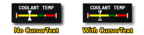
Used by the Horizontal, DoubleHorizontal (defines the top cursor text), and DoubleVertical (defines the left cursor text) instrument types.
<CursorText2>
This element is a sub-element of <Gauge>, has no attributes, and is used to define a string that will be drawn over the cursor. There is no limit to the length of this string, but due to the size of the cursor being fixed, we recommend that you only use a single character - for example "L" or "R" - since additional characters will cause the text to overspill the cursor and be unreadable. See <CursorText> for an example image.
Used by the DoubleHorizontal (defines the right cursor text) and DoubleVertical (defines the bottom cursor text) instrument types.
<Text>
This element can be used within <Gauge> to define text-only instrument that is to be displayed. The text itself is defined using one of the position sub-elements: <Left>, <Center>, or <Right>. The element has the following optional attributes:
| Attribute | Description | Type | Required |
|---|---|---|---|
id |
The unique ID of the text element. | String/Int | No |
fontsize |
The size of the font to be used for the text element. | Float | No |
Below is a basic example of a text-only instrument definition:
<Text>
    <Center>FUEL FLOW</Center>
</Text>
<Text>
    <Left>
        <ToFixed precision="1">
            <Simvar name="ENG FUEL FLOW GPH:1" unit="gallons per hour"/>
        </ToFixed>
    </Left>
    <Center>
        <Content>GPH</Content>
        <Color>green</Color>
    </Center>
    <Right>
        <ToFixed precision="1">
            <Simvar name="ENG FUEL FLOW GPH:2" unit="gallons per hour"/>
        </ToFixed>
    </Right>
</Text>
The above would look like this in the glasscockpit display:

<Left>
This is a sub-element of <Text> and has no attributes. Text will be displayed on the far left of the area where the parent element is being positioned. In general, the text to be displayed goes within these tags, however if you wish to colour it, you will need to use the sub-element <Content> for the text and <Color> for the colour.
<Content>
This is a sub-element of <Left>, <Center>, or <Right> and is only required when you are also including the <Color> sub-element. Its sole purpose is to hold the text to be displayed (see the above example for <Text>).
<Color>
This is a sub-element of <Left>, <Center>, or <Right> and using it will also require you to use the <Content> sub-element. The element takes a colour string which will be used to colour the text being displayed (see the above example for <Text>). Colours should be CSS compliant, but note that generally only the following are used: red, yellow, green, white, blue, magenta.
<Center>
This is a sub-element of <Text> and has no attributes. Text will be displayed in the center of the area where the parent element is being positioned. In general, the text to be displayed goes within these tags, however if you wish to colour it, you will need to use the sub-element <Content> for the text and <Color> for the colour.
<Right>
This is a sub-element of <Text> and has no attributes. Text will be displayed on the far right of the area where the parent element is being positioned. In general, the text to be displayed goes within these tags, however if you wish to colour it, you will need to use the sub-element <Content> for the text and <Color> for the colour.
<ColumnsGroup>
This is a container element for the <Column> sub-element, of which there should always be two. It is used to tell the simulation to display two guages side by side. Note that this element can be nested within a <Column> sub-element to create rowns of gauges, for example:
<EngineDisplay>
    <ColumnsGroup>
        <Column width="43">
            <ColumnsGroup>
                <Column>
                    <Gauge>
                        <!-- Gauge Data Here -->
                    </Gauge>
                </Column>
                <Column>
                    <Gauge>
                        <!-- Gauge Data Here -->
                    </Gauge>
                </Column>
            </ColumnsGroup>
        </Column>
        <Column>
            <Gauge>
                <!-- Gauge Data Here -->
            </Gauge>
            <Gauge>
                <!-- Gauge Data Here -->
            </Gauge>
        </Column>
        <Column>
            <Gauge>
                 <!-- Gauge Data Here -->
            </Gauge>
            <Gauge>
                 <!-- Gauge Data Here -->
            </Gauge>
        </Column>
    </ColumnsGroup
</EngineDisplay>
<Column>
This is a sub-element of the <ColumnsGroup> container, and is used to specify a gauge that should be displayed beside another one, using the <Gauge> element. You must have two of these elements within each <ColumnsGroup> and the first defines the left gauge, and the second the right. The element can have the following (optional) attribute:
| Attribute | Description | Type | Required |
|---|---|---|---|
width |
This is the width of the column expressed as a percentage, where 100% is considered the total width of the |
String | No |
<Condition>
This element defines the condition(s) under which an annunciation or voice alert should be triggered. It is primarily a sub-element of <Annunciations>, <Alert>, and <State> , although it can be used in many other situations (for example, as part of an <If>). It has the following optional attribute:
| Attribute | Description | Type | Required |
|---|---|---|---|
Suffix |
This adds a specific suffix onto the
See Using The Suffix Attribute, below, for more information. |
String | No |
It is important to note that you may use many of the Panel XML Logic Elements - like <And>, <Or>, <Lower>, <GreaterEqual>, etc... - along with the <Simvar /> element or Unique Logic Elements within the <Condition> element to define the true/false state which will trigger the condition (or not).
Using The Suffix Attribute
The Suffix attribute can be used in a condition that is being created for an <Annunciation> element. The way it works is as follows:
- Your JS code inherits from the
NavSystemsubclass. - Your XML has conditions for one, two or three of the possible suffix strings.
- If one of the conditions is true, then the suffix string is appended onto the
<Text>element string.
The following example shows how the XML should be structured when using this attribute:
<Annunciation>
    <Type>Caution</Type>
    <Text>PITOT HT ON </Text>
    <Condition Suffix="L-R">
        <And>
            <Lower>
                <Simvar name="PROP RPM:1" unit="rpm"/>
                <Constant>1</Constant>
            </Lower>
            <And>
                <Simvar name="L:XMLVAR_Pitot_1" unit="Bool"/>
                <Simvar name="L:XMLVAR_Pitot_2" unit="Bool"/>
            </And>
        </And>
    </Condition>
    <Condition Suffix="L">
        <And>
            <Lower>
                <Simvar name="PROP RPM:1" unit="rpm"/>
                <Constant>1</Constant>
            </Lower>
        <Simvar name="L:XMLVAR_Pitot_1" unit="Bool"/>
        </And>
    </Condition>
    <Condition Suffix="R">
        <And>
            <Lower>
                <Simvar name="PROP RPM:1" unit="rpm"/>
                <Constant>1</Constant>
            </Lower>
        <Simvar name="L:XMLVAR_Pitot_2" unit="Bool"/>
        </And>
    </Condition>
</Annunciation>
<Simvar />
This self-closing element is a sub-element of multiple other elements and is used to define a SimVar that should be used by the associated variable or element. It is used by: <[CUSTOM]>, <Electric>, and as part of the <Condition> element, and can be nested within other Panel XML Logic Elements to create a complex expression.
This element has the following attributes:
| Attribute | Description | Type | Required |
|---|---|---|---|
name |
The name of the SimVar that is being referenced along with any parameters, separated by a colon. You can find a complete list of available SimVars here: Simulation Variables Below you can find an example of how the attribute is formatted: name="GENERAL ENG OIL PRESSURE:1" |
String | Yes |
unit |
The unit that the SimVar should be using, which should be one of the accepted strings listed here: Simulation Variable Units For example: unit="psi" |
String | Yes |
<Gamevar />
This self-closing element is a sub-element of multiple other elements and is used to define a Game Variable that should be used by the associated variable or element. It is used by: <[CUSTOM]>, <Electric>, and as part of the <Condition> element, and can be nested within other Panel XML Logic Elements to create a complex expression.
IMPORTANT! This is a deprecated tag and should not be used. You should be using the <Simvar /> element instead. Legacy aircraft that still use this tag will work in the current version of the simulation, but future versions cannot guarantee this.
This element has the following attributes:
| Attribute | Description | Type | Required |
|---|---|---|---|
name |
The name of the Game Variable that is being referenced along with any parameters, separated by a colon. Below you can find an example of how the attribute is formatted: name="GENERAL ENG OIL PRESSURE:1" |
String | Yes |
unit |
The unit that the Game Variable should be using, which should be one of the accepted strings listed here: Simulation Variable Units For example: unit="psi" |
String | Yes |
<Constant>
This element is used to hold a single constant value and is used as part of the expression being evaluated within <[CUSTOM]>, <Electric>, or <Condition> elements. It can also be nested within other Panel XML Logic Elements to create a complex expression.